Clear hierarchy
Strong section headers, disciplined typography, and repeatable data treatments make dense technical pages easier to scan.
One example of commercial graphic design work: a 36-page industrial product catalog. It shows how dense product information, typography, layout, photography, technical tables, brand consistency, and print production come together.

This project is here as a portfolio example—not as a catalog sales page. The challenge was taking a large amount of technical product information and making it clear, consistent, visually strong, and usable across many different page types.
Strong section headers, disciplined typography, and repeatable data treatments make dense technical pages easier to scan.
The catalog can shift between product grids, editorial feature pages, comparison charts, and spec-heavy layouts while still feeling like one brand.
The work was prepared as practical commercial collateral, balancing visual polish with the realities of product accuracy, revisions, and print production.
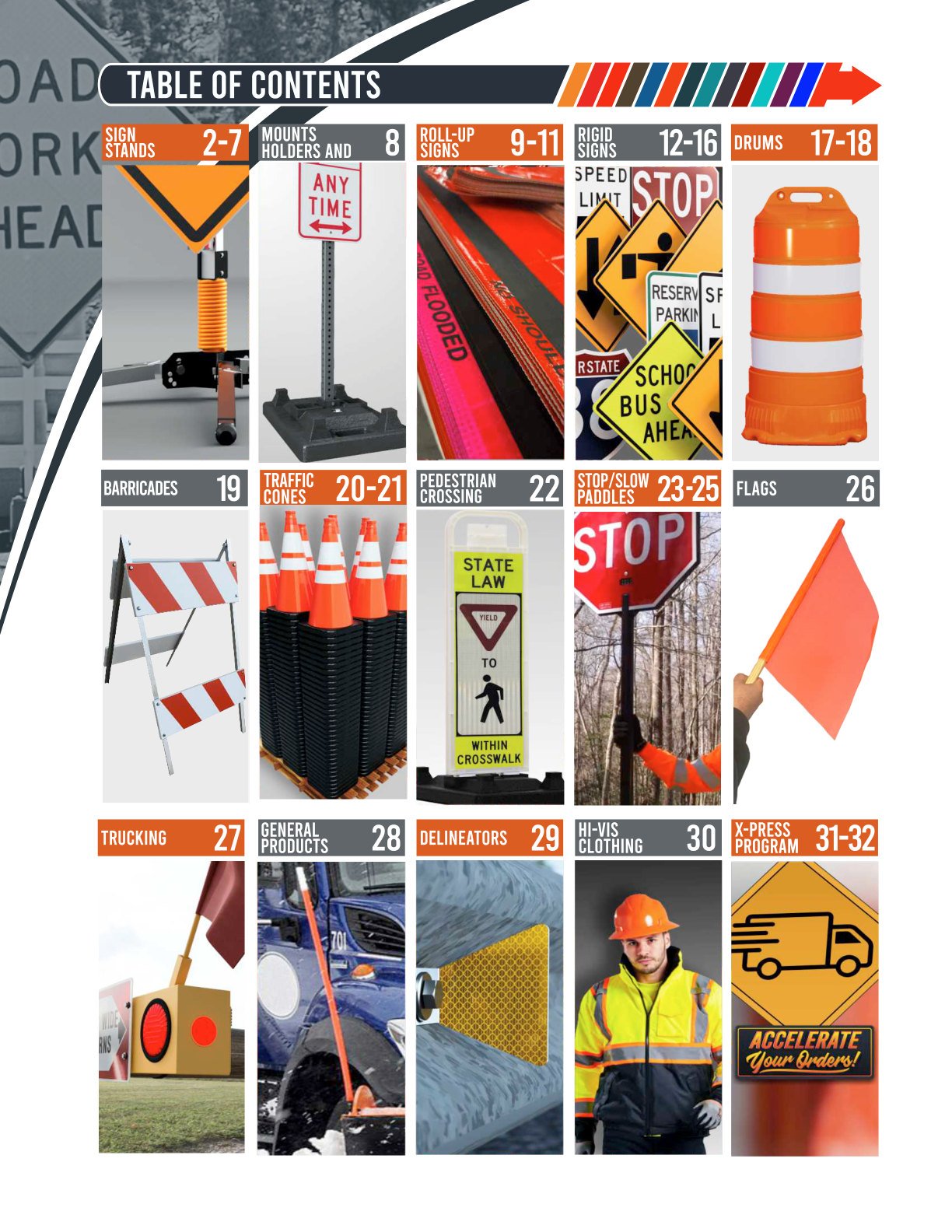
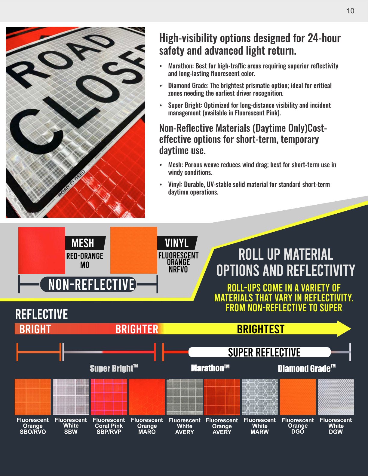
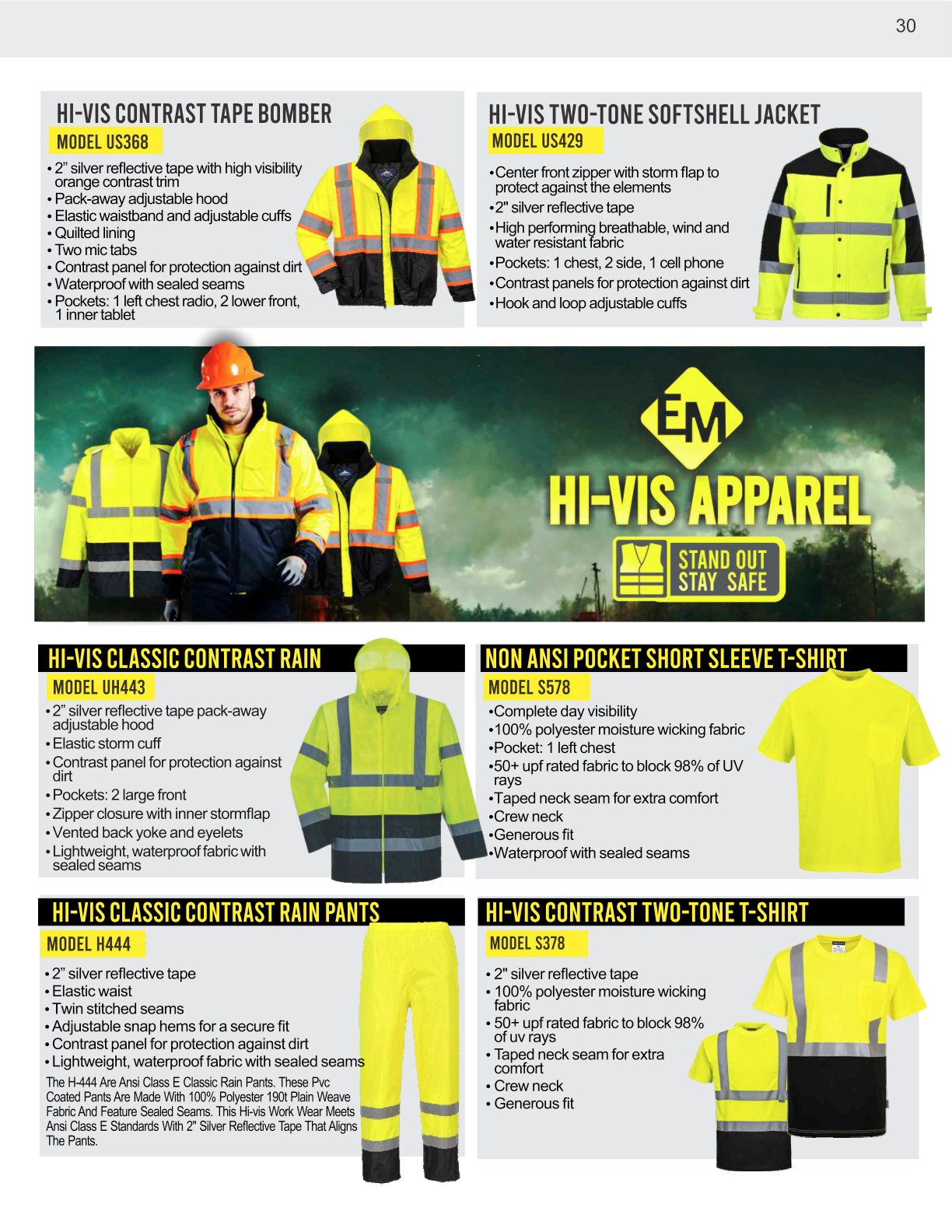
A few pages that show the range of the system—from navigation and technical comparison graphics to campaign-style product features.




This catalog is one example of that work. STNY can also apply the same design thinking to sales sheets, branding, digital graphics, websites, signage, and other customer-facing materials.